Why the Teacher App Isn’t Optimised for Phones
Why the Teacher App Isn’t Optimised for Phones
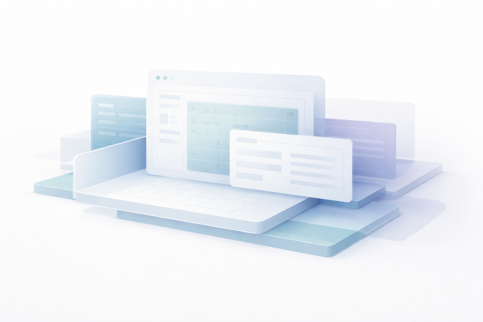
The My Music Studio teacher app is a work tool.
It supports tasks that involve dense information, require precision, and carry real consequences if done incorrectly. Because of that, decisions about how and where it should work are not just questions of convenience — they are questions of correctness.
Optimising prematurely for phone-sized screens can increase error rather than reduce friction. This article explains why the teacher app is currently designed to be desktop-first, and how that choice is intended to protect teachers rather than limit them.
Professional tasks need space
Teaching administration involves more than checking a single piece of information.
Teachers regularly work with:
• schedules,
• student records,
• billing,
• permissions,
• and multi-step actions that affect multiple people at once.
These are not “glanceable” interactions.
For example, building or adjusting a complex timetable requires a clear overview. Teachers need to see how students, times, and availability relate to one another, and they need to be able to make edits without losing sight of that broader context.
Phone-sized interfaces make this difficult. To fit, they often:
• hide context,
• collapse related information into separate screens,
• increase the likelihood of mis-taps,
• and make error states harder to notice.
In this kind of work, reducing visible information doesn’t reduce effort — it increases risk. A larger screen supports safer decision-making by keeping context visible while changes are made.
Why partial optimisation causes problems
A partially phone-optimised app is often worse than a clearly desktop-first one.
When some screens work well on a phone and others do not, users are left guessing:
• which actions are safe to attempt,
• which screens will behave as expected,
• and which errors are caused by their input versus the interface itself.
That uncertainty erodes trust.
Delaying phone optimisation until it can be done coherently avoids this class of problem. It ensures that when mobile support is introduced, it is predictable, consistent, and aligned with how teachers actually work, rather than being an uneven layer added on top.
This is not about withholding functionality. It is about avoiding situations where the interface invites actions that are easy to start and difficult to undo.
Different roles deserve different interfaces
Not every role in a music studio interacts with the same volume or type of information.
Teacher administration involves many students and many interconnected decisions. Parent and student access does not.
Parents and students typically need to:
• check lesson times,
• review notes for practice,
• access information related only to their own lessons.
The scope is smaller, the context is simpler, and the interactions are naturally suited to mobile use. That’s why parent and student access is designed with mobile optimisation in mind.
This separation reflects a broader design principle: access does not imply identical interfaces.
Different roles deserve interfaces that match the nature of their work, not a single compromise that fits no one particularly well.
Where mobile use does make sense for teachers
This does not mean that mobile use is inappropriate everywhere in the teacher experience.
There are specific teacher workflows where phone access is both useful and low-risk. For example:
• viewing the day’s schedule,
• opening lesson notes during a lesson,
• marking attendance.
Many teachers are comfortable having a laptop nearby during lessons to type notes as needed. Others find that this interrupts their flow, and for them, lightweight mobile access to a small subset of actions can be valuable.
These are areas that are appropriate for targeted mobile optimisation over time, because they are bounded, contextual, and do not require managing large amounts of information at once.
The distinction is intentional: optimise mobile use where it supports teaching, not where it introduces avoidable complexity.
Choosing restraint over reach
Just because something is technically possible does not mean it should be frictionless everywhere.
Designing the teacher app as desktop-first reflects a set of priorities:
• correctness over availability,
• context over speed,
• and appropriateness over feature parity.
Saying “not yet” to full phone optimisation is not a lack of ambition. It is a decision to prioritise clarity, safety, and trust in the tools teachers rely on to run their studios.
When mobile optimisation is introduced more broadly, it should make the work better, not merely smaller.